01. Logo re-design
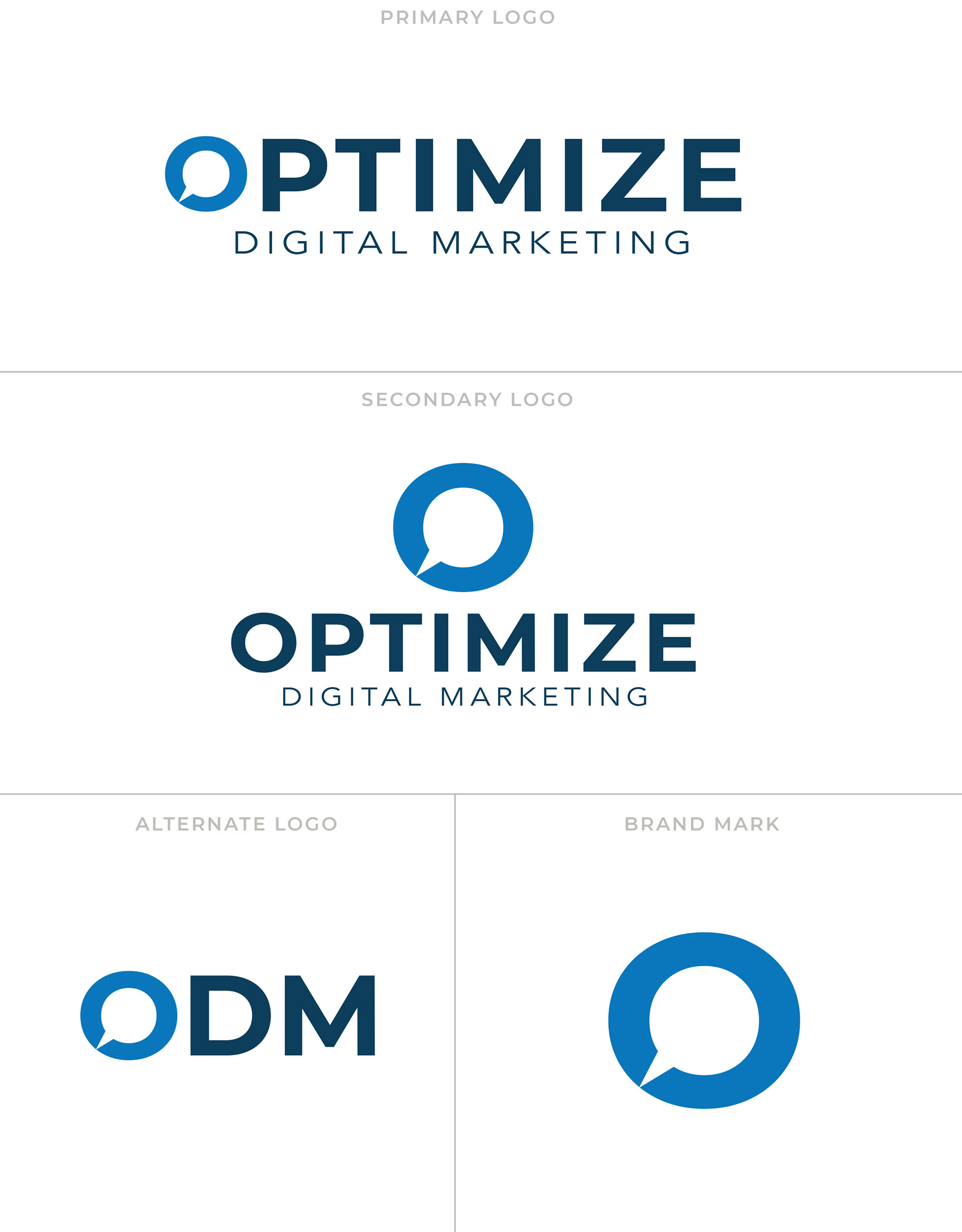
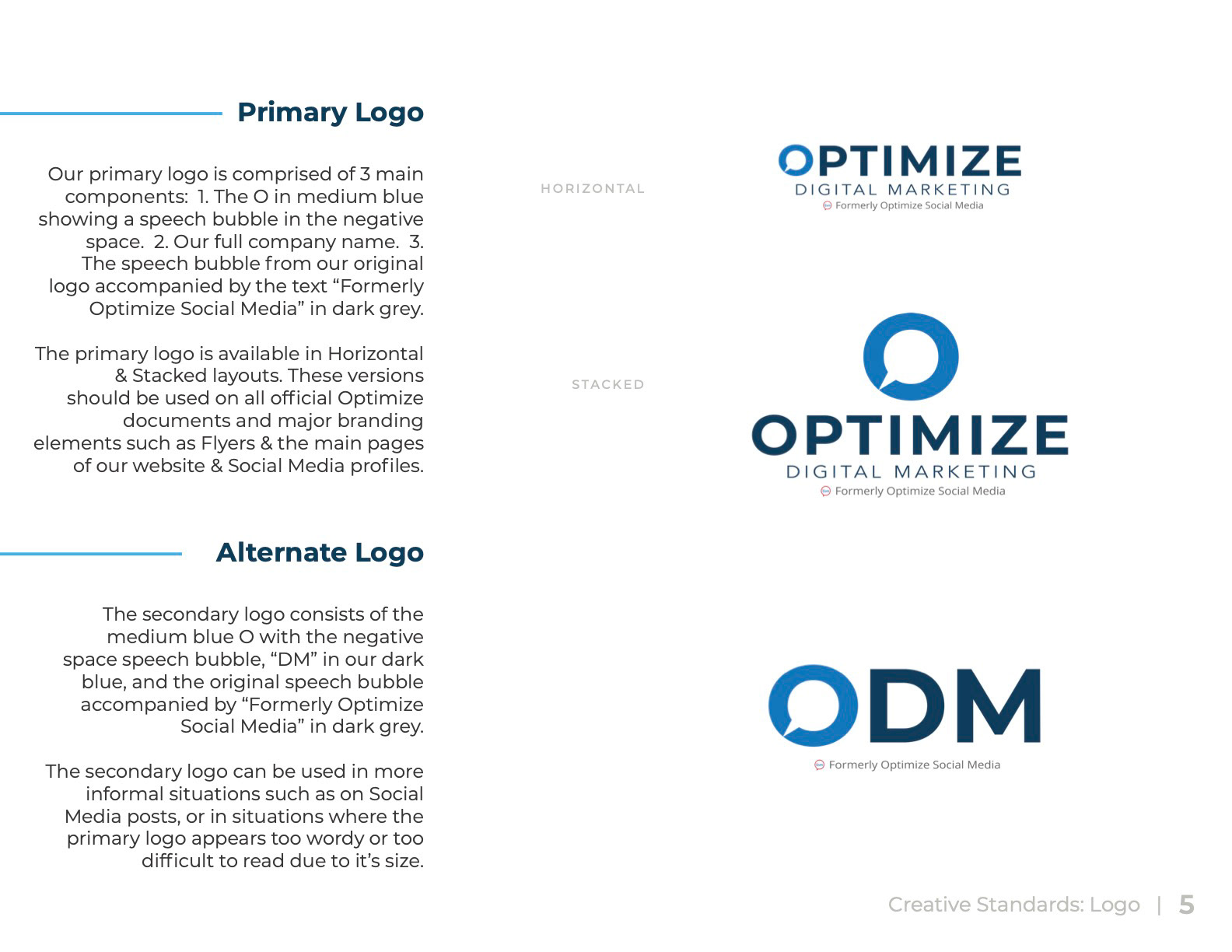
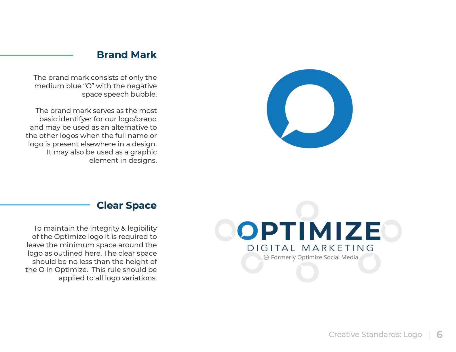
The most recognizable piece of the original logo was the speech bubble so to maintain the company's brand recognition I decided to keep that as the main feature in the new logo. I also felt that the speech bubble was still a great visual representation of what marketing really is - communication with your audience.
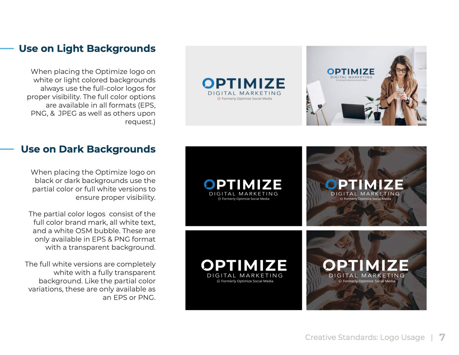
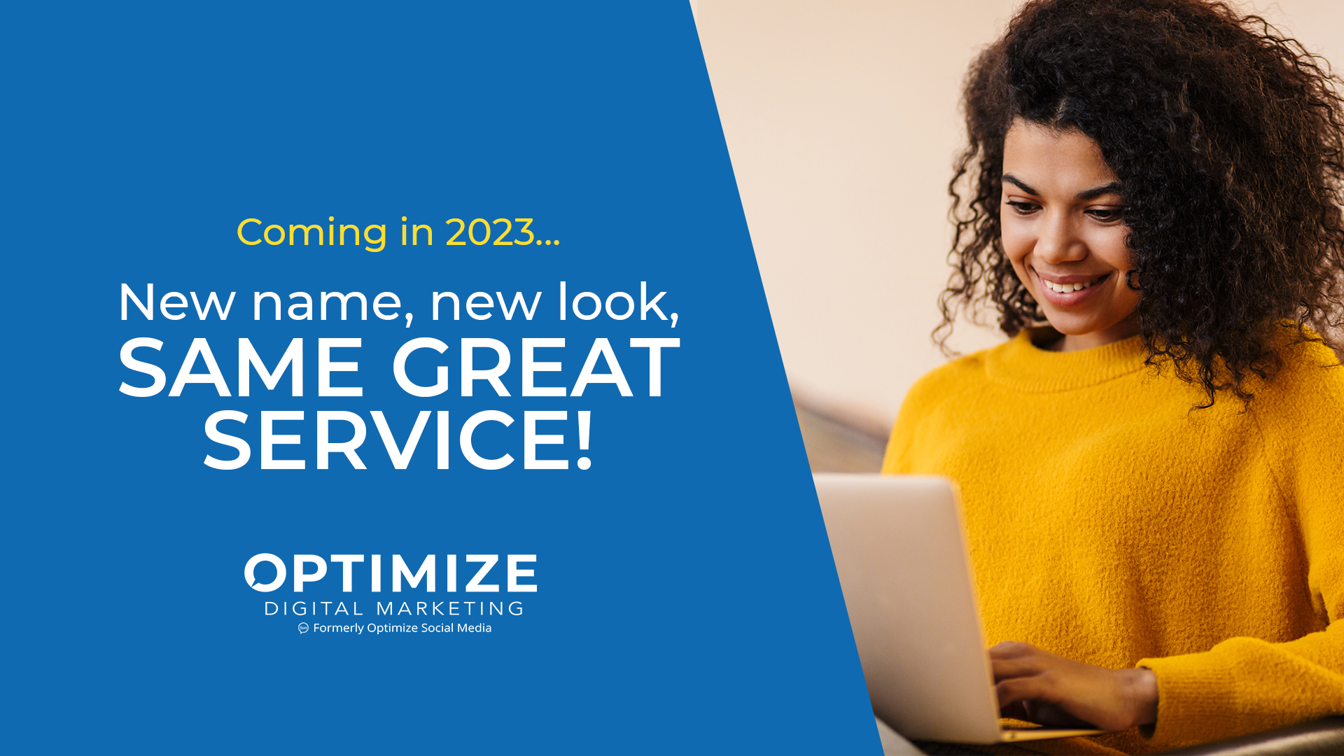
It was decided that for the first year of the changeover, we would include the "bubble" portion of the old logo and the text "Formerly Optimize Social Media" very small at the bottom of the logo in order to maintain brand recognition in our market. After a year had passed we began slowly phasing out the "Formerly..." portion of the design.
02. Brand Guidelines
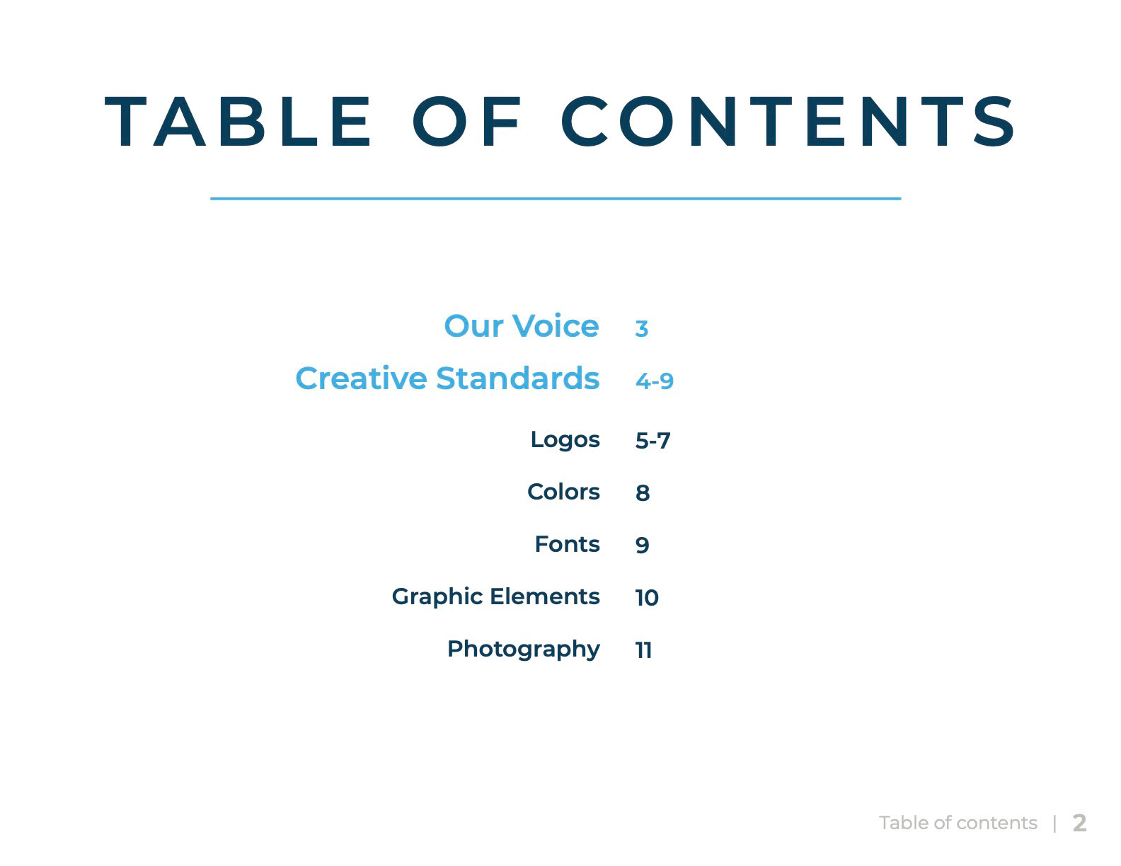
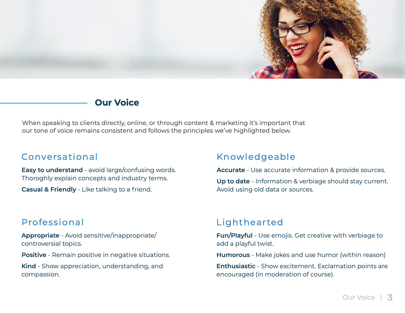
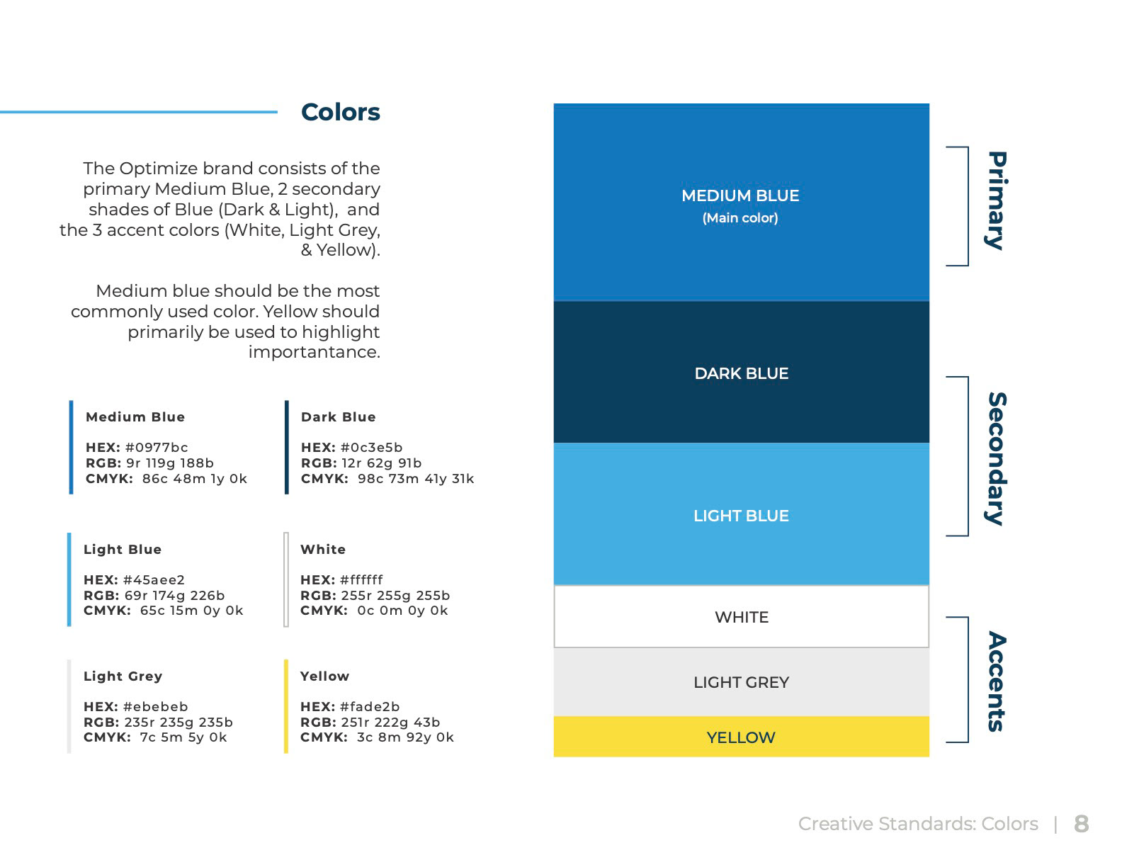
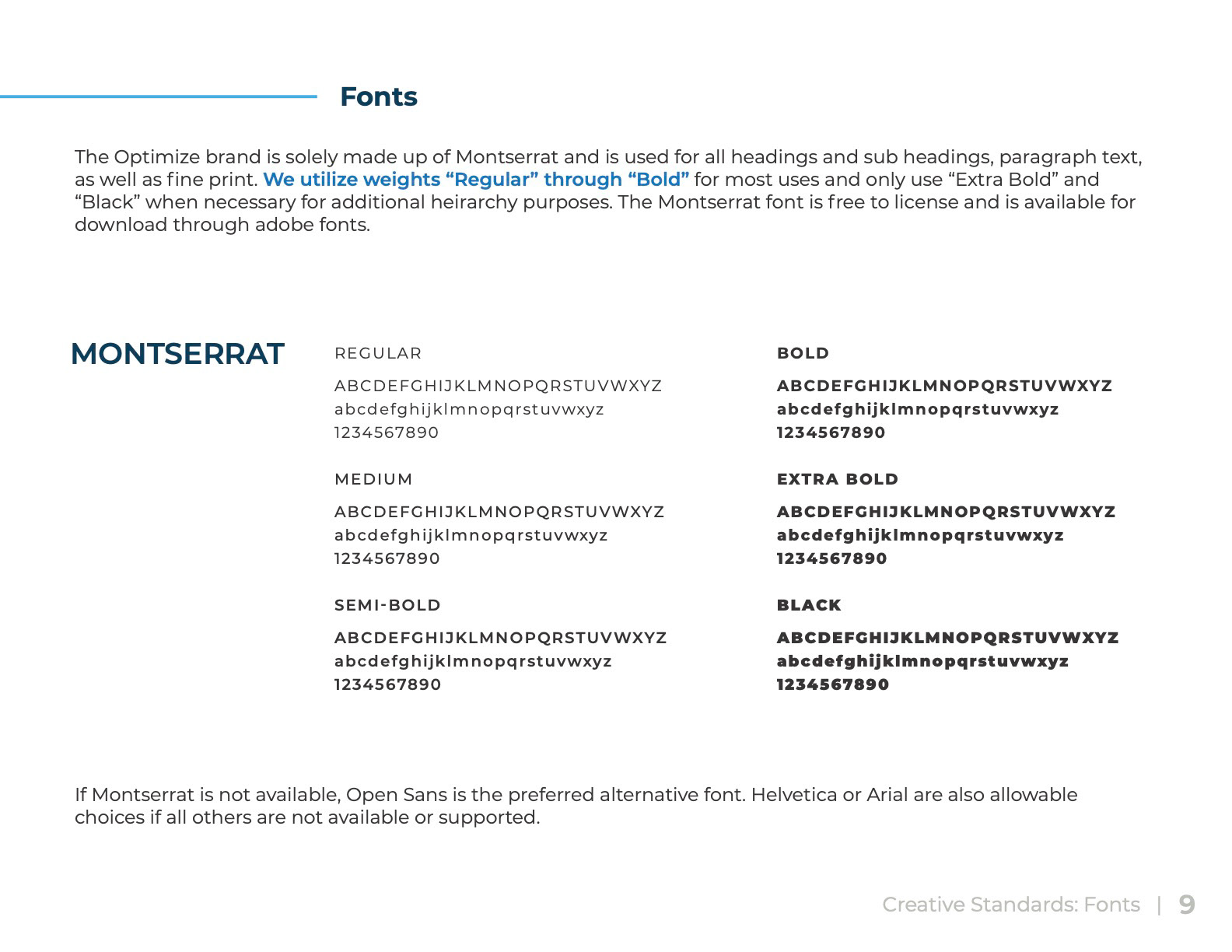
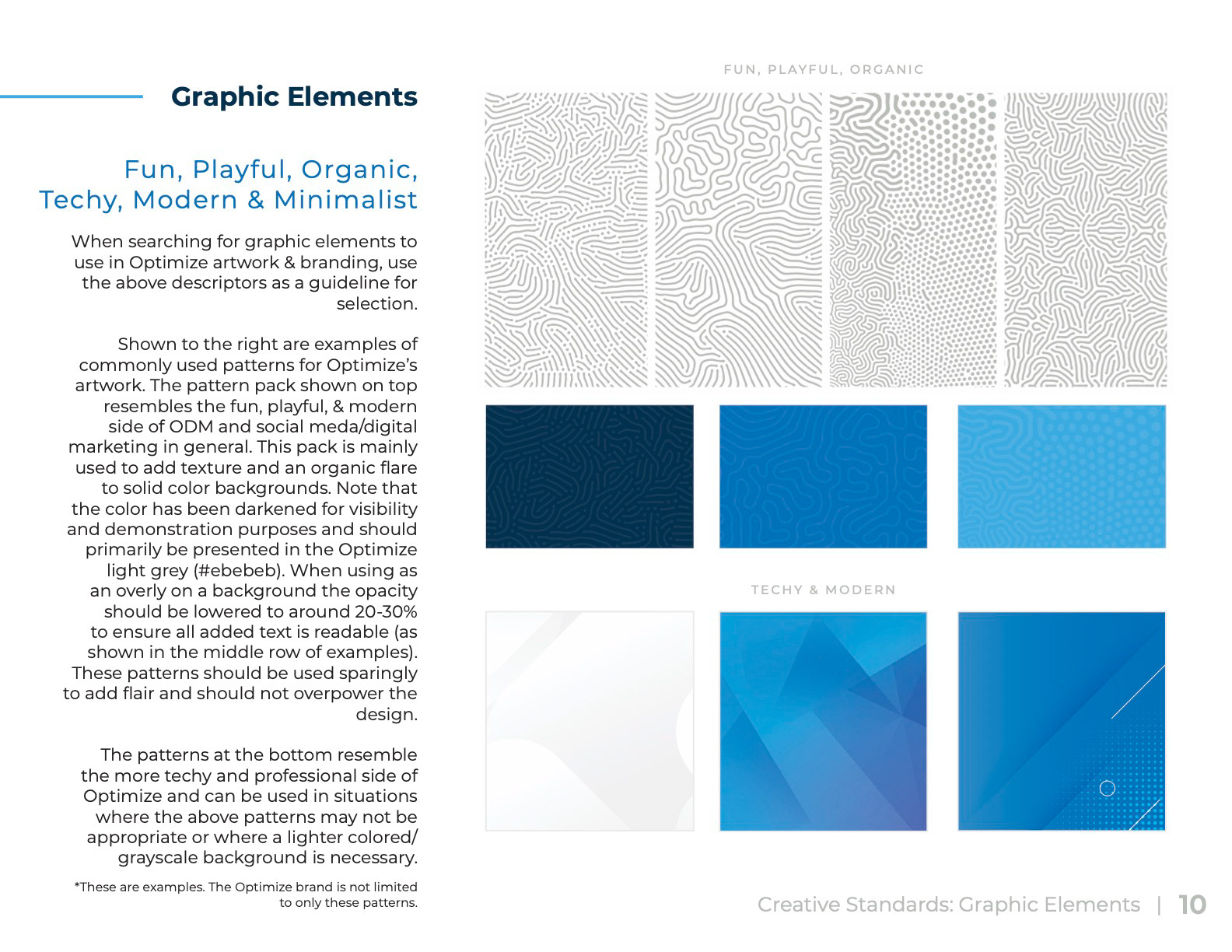
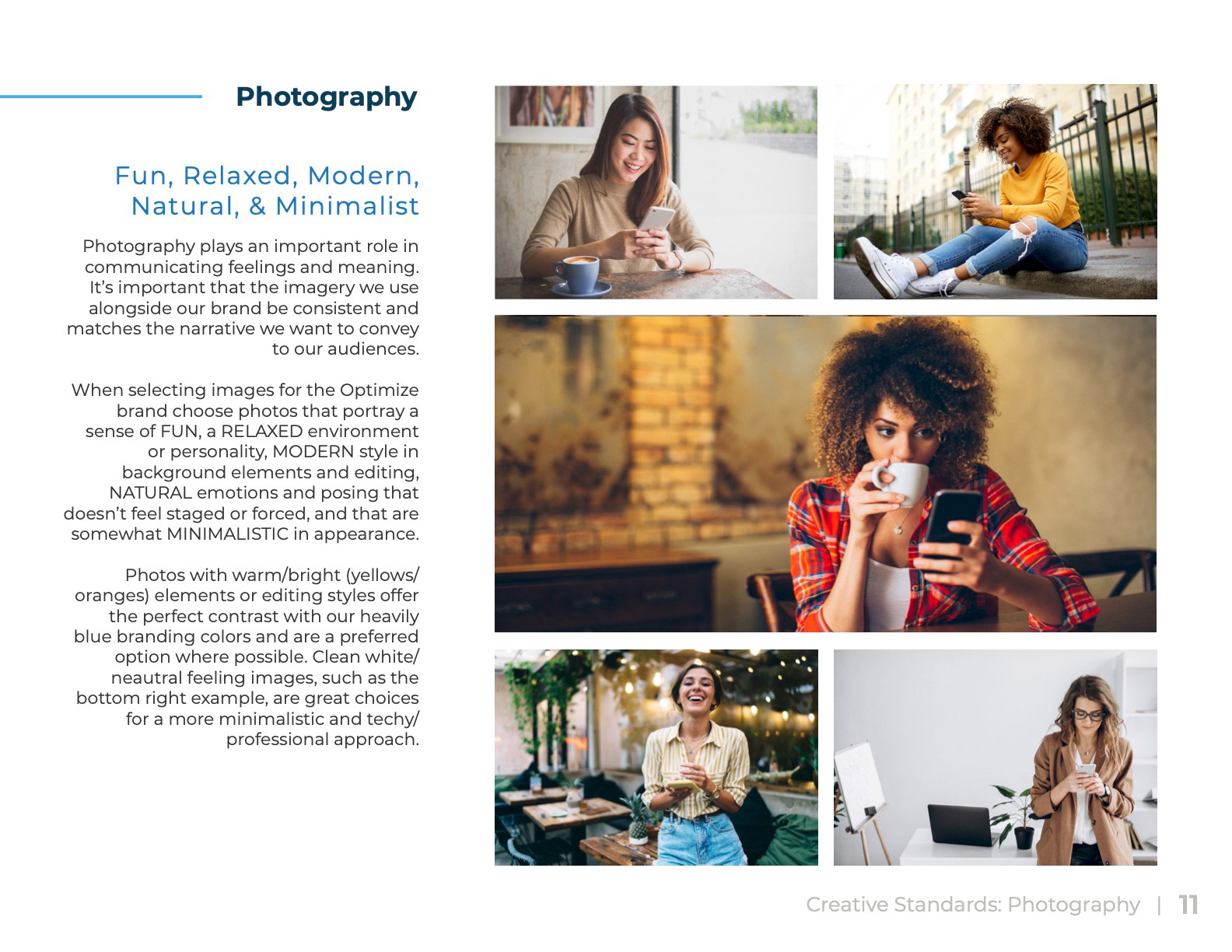
Optimize had never had set guidelines for their branding, so with this rebrand I wanted to be sure that everyone understood how our brand should look, feel, and sound. I wrote a series of rules for using our logos and guidelines for other creative, as well as developed descriptions of our brand voice and put everything together into a complete Brand Guide.
03. Announcing the Rebrand
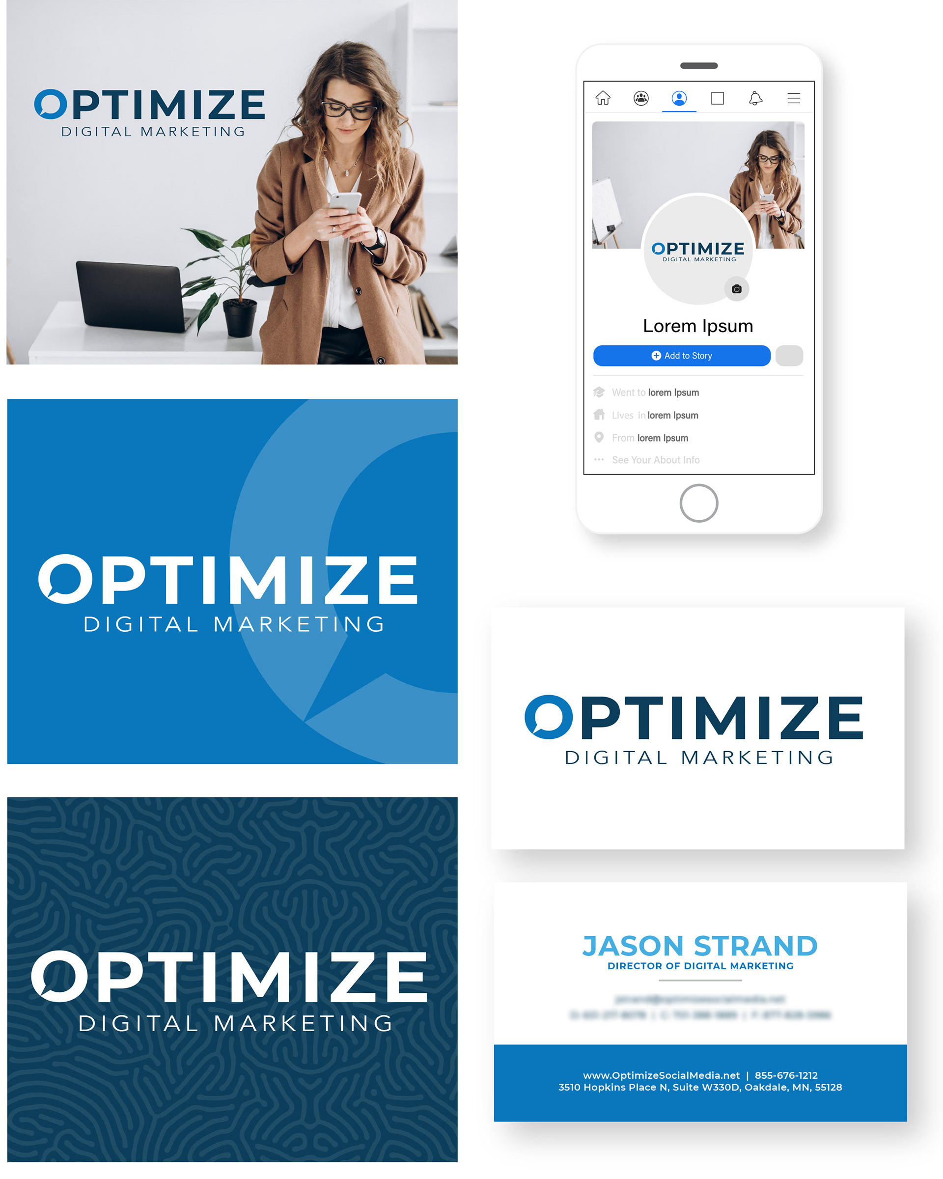
Facebook ads, email assets, and a banner for signature tags were created to help announce the big change to our clients, partners, and leads.

04. Rebrand Party Merch
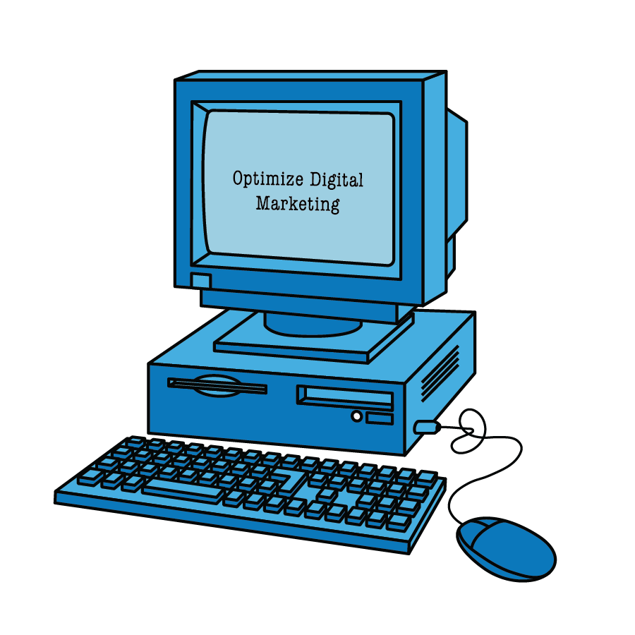
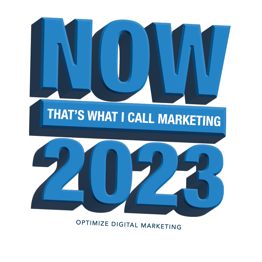
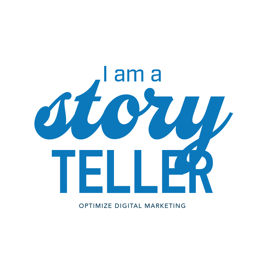
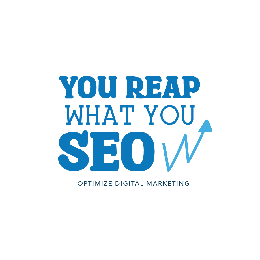
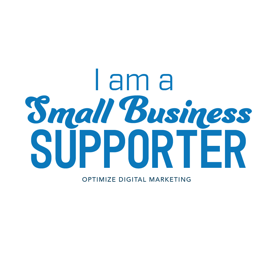
We planned a rebrand party to celebrate with our employees. As part of the celebration, each employee was gifted some new ODM merch, which included some fun stickers related to marketing. Below are a few of the designs that were chosen.
05. Updating Content
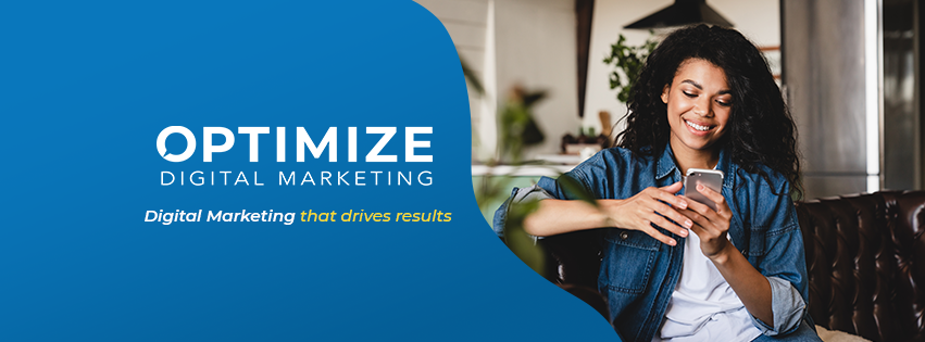
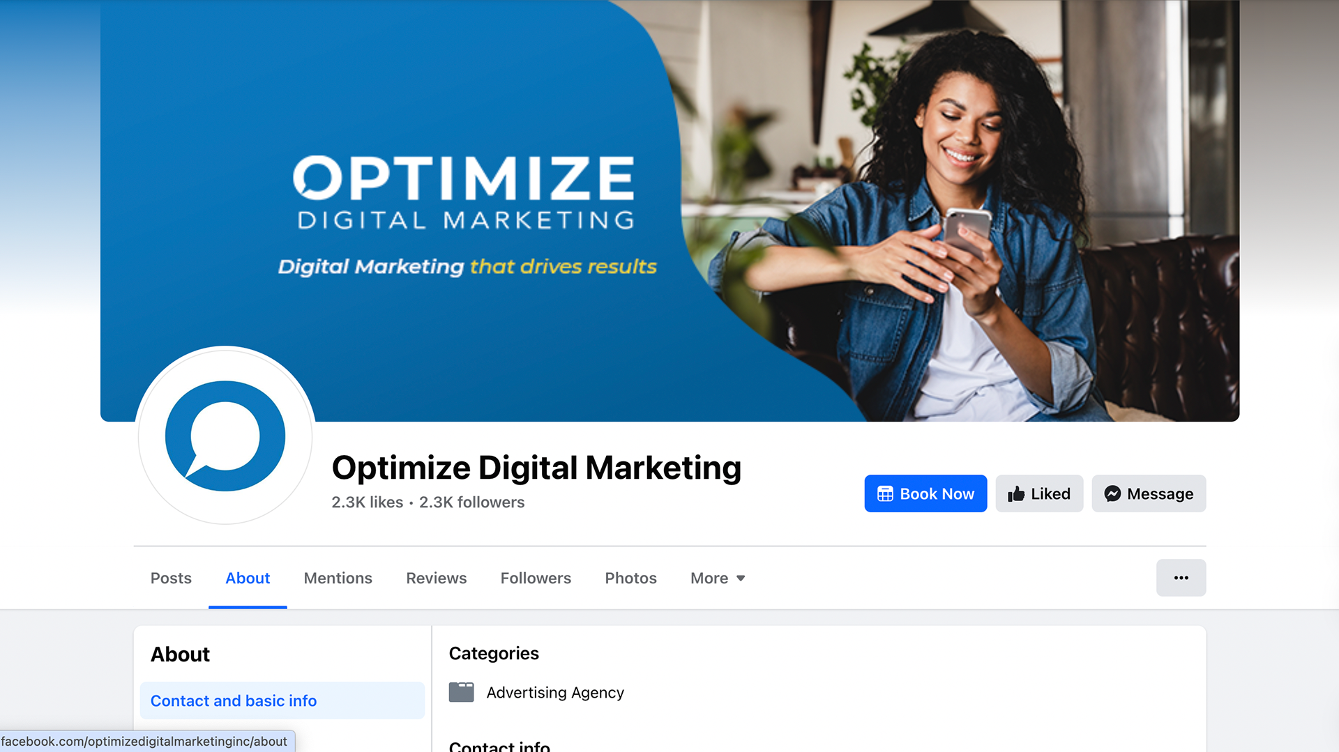
With a new name and logo naturally all of our content needed to be updated to match. I designed a new cover photo for our social platforms and began utilizing the new branding in all new content moving forward.


06. 2024 Updates
As of 2024 Optimize has removed the "Formerly Optimize Social Media" text and the old speech bubble from the new logo. I also went back and made a few tweaks to the logo after using it for some time and finding ways it could be improved. For starters, I widened the triangular space that creates the speech bubble in the negative space in order to make the shape feel more balanced and to allow embroidery machines to stitch the bubble more easily. In addition, I increased the size of the "Digital Marketing" text, again for more balance across different use cases as well as enhanced visibility at smaller sizes.
