
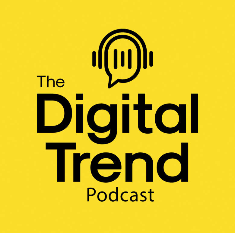
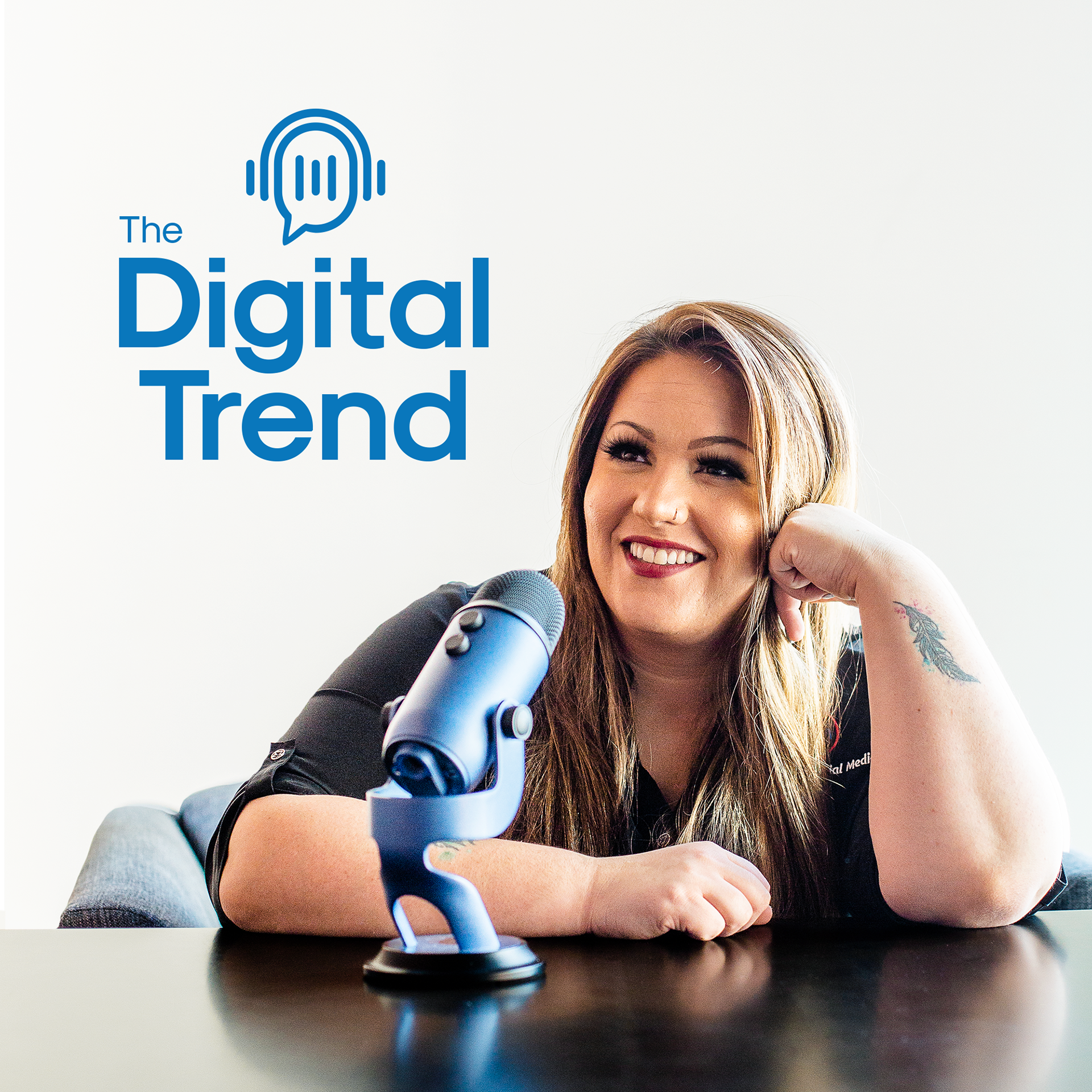
I wanted to keep the logo simple with clean lines to elude to the digital aspect of the name and to keep it feeling modern. The speech bubble is a subtle nod to the speech bubble in the Optimize logo and the conversations to be had on the podcast. The icon also includes audio lines as well as the appearance of headphones, which podcasters typically wear while recording.
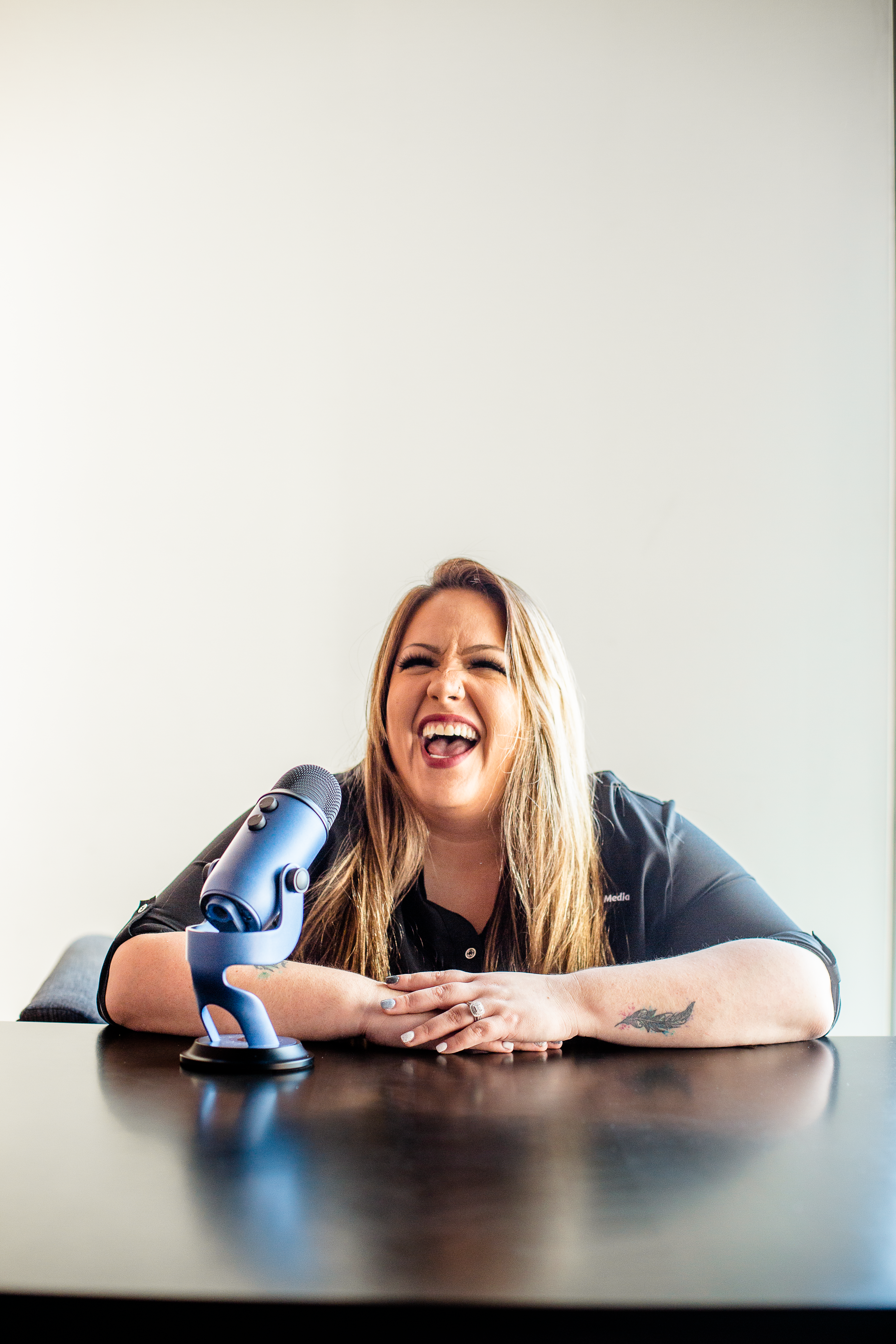
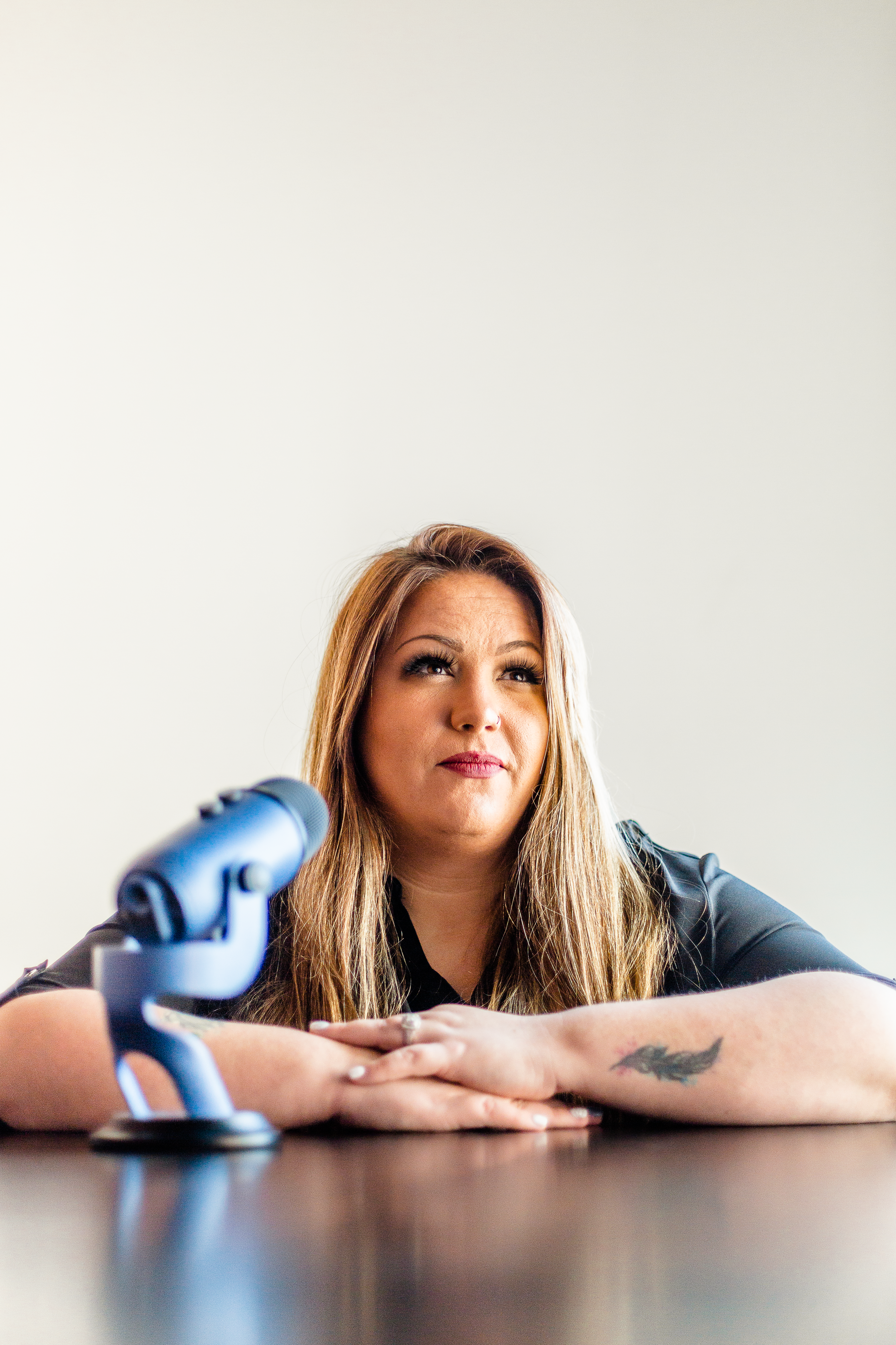
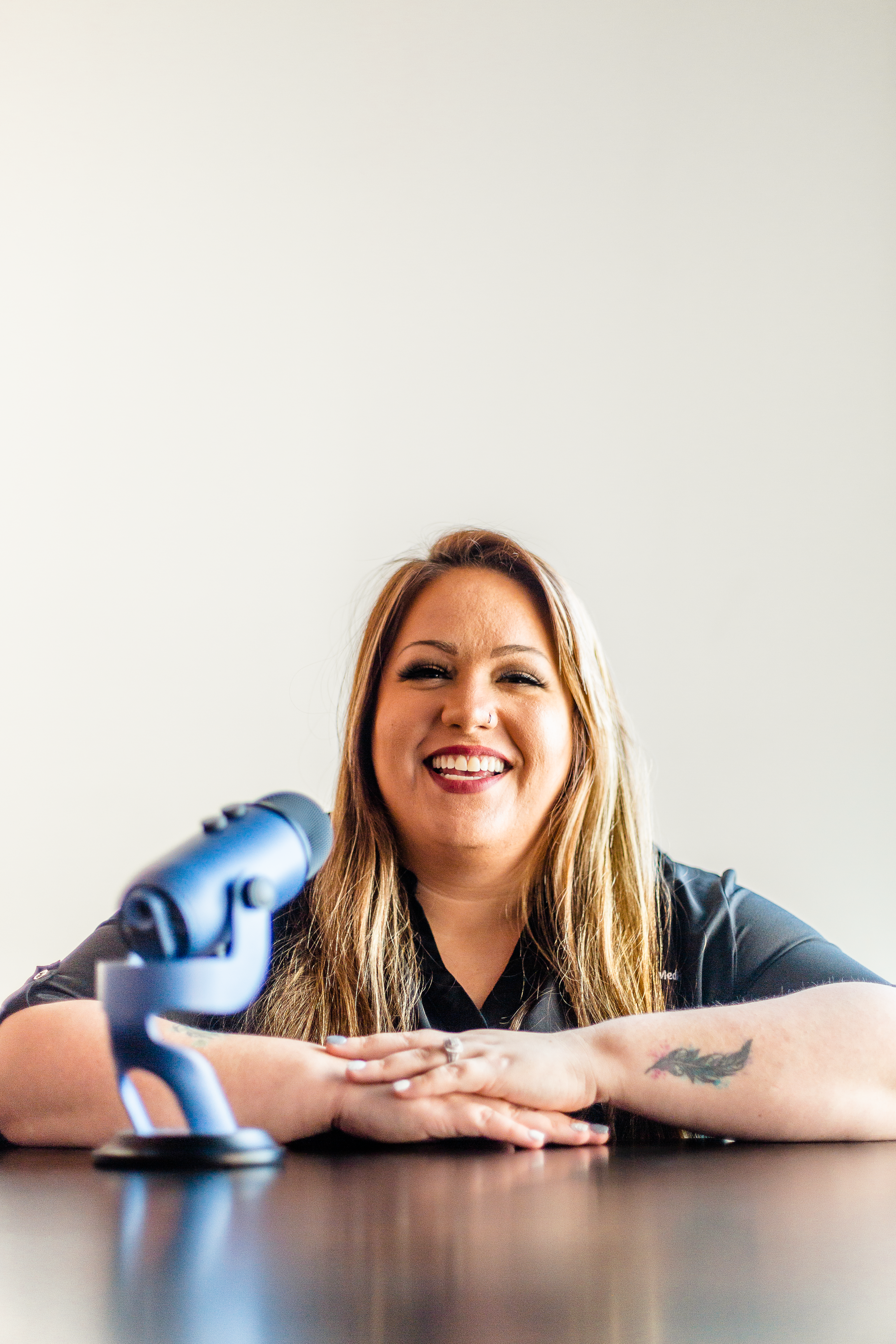
We found an area with the best natural light and a white wall to set up a table with a podcast mic for the host to appear as she would in the episodes. Being that the podcast will be geared towards helping automotive businesses with marketing, we took a few shots of her playing with toy cars to be used for promotion.
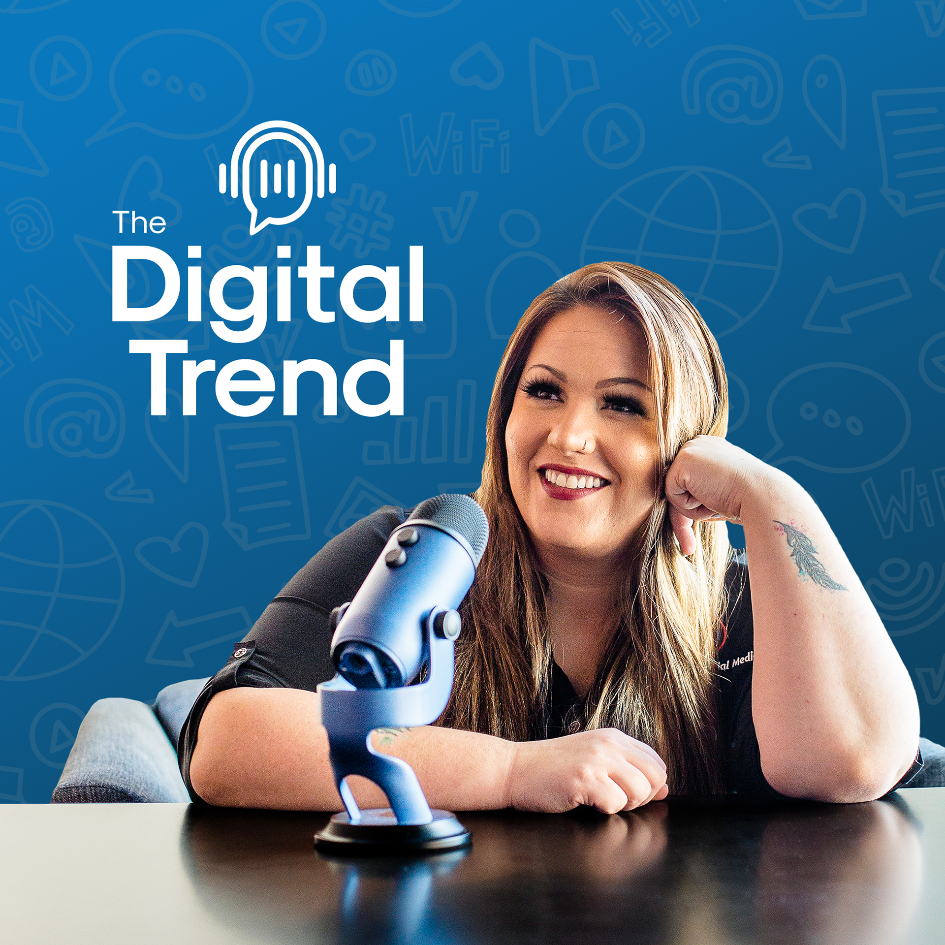
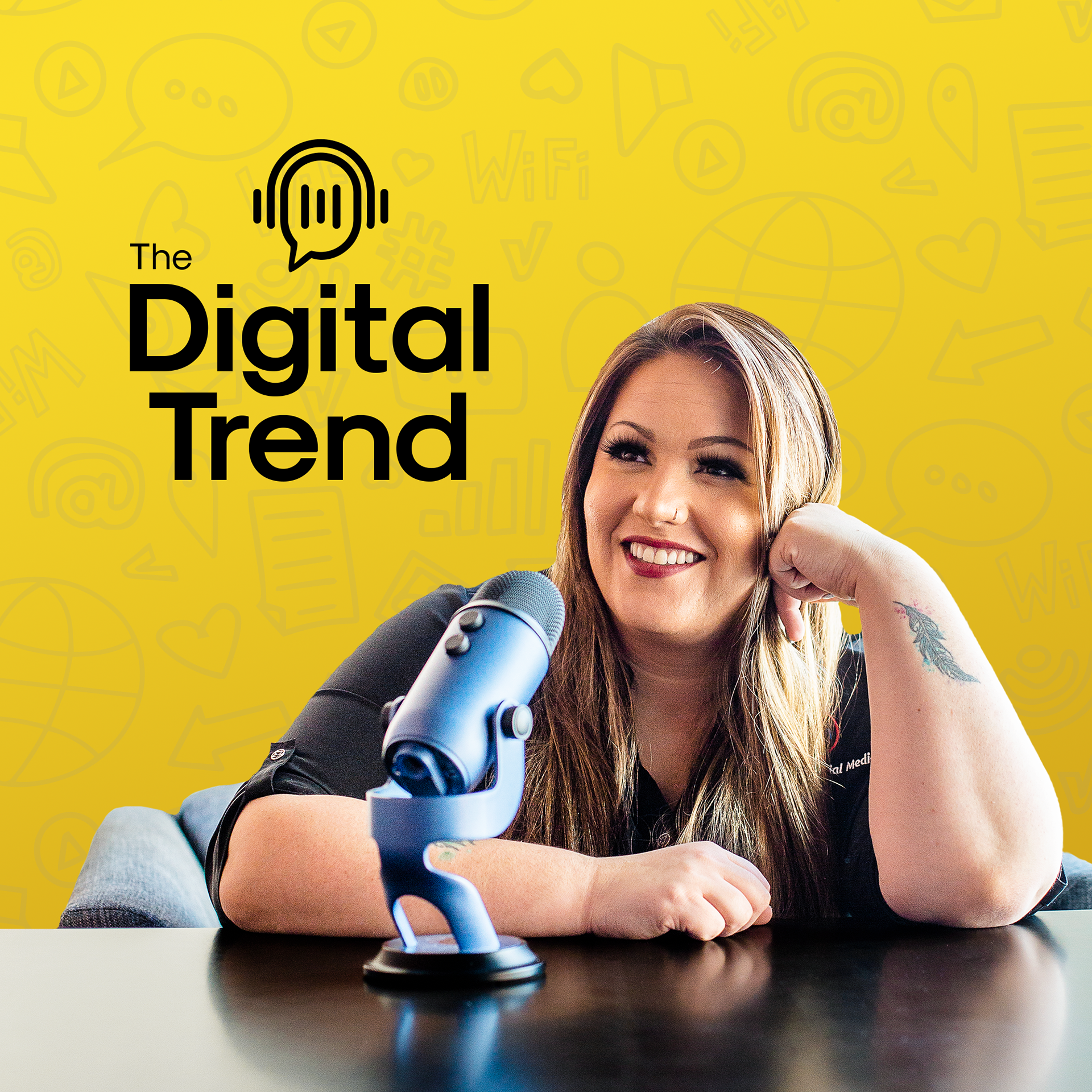
I experimented with a few different color palettes, starting with Optimize's main colors (blue & white), but after some discussion and research, we landed on black and yellow. The yellow used is a small portion of the Optimize brand and thus connects the two but allows The Digital Trend to be its own extension of the brand. Black and yellow also serve as a high-contrast combo to catch viewers' attention against other podcasts in the same category.
